The summary is here…
”Our demand growth estimate for 2017 remains strong at 1.6 mb/d, reinforced by November data for the US. For 2018, the more positive global economic picture published by the International Monetary Fund is a key factor in raising our growth outlook to 1.4 mb/d. It was thought that the significant increase in the dollar price of crude oil since the middle of 2017 would dampen growth, and this might be the case to some extent, but the impact of higher prices has been partly offset in some countries by currency appreciations.”
And, this:
”It is clear that strong demand growth in 2017, alongside a modest increase last year in non-OPEC output, and the cuts made by leading producers, has contributed to the extraordinarily rapid fall in OECD oil stocks. A year ago, they were 264 mb above the five-year average and now they are only 52 mb in excess of it, with stocks of oil products actually below the benchmark. Although the OECD is not the whole world, the leading oil producers who agreed to cut output identified the level of the group’s stocks as an indicator of the progress of their initiative. With the surplus having shrunk so dramatically, the success of the output agreement might be close to hand. This, however, is not necessarily the case: oil price rises have come to a halt and gone into reverse, and, according to our supply/demand balance, so might the decline in oil stocks, at least in the early part of this year.”
And, this is amazing:
”Today, having cut costs dramatically, US producers are enjoying a second wave of growth so extraordinary that in 2018 their increase in liquids production could equal global demand growth. This is a sobering thought for other producers currently sitting on shut-in production capacity and facing a renewed challenge to their market share. Another sobering thought is that it is not just a matter of production: trade patterns are changing. Recently we read of a shipment of condensate from the US to the UAE. Such a development would have seemed incredible a few years ago, now it looks like the shape of things to come.”
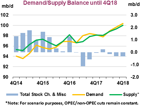
Here is their chart showing supply/demand:

Leave a Reply